
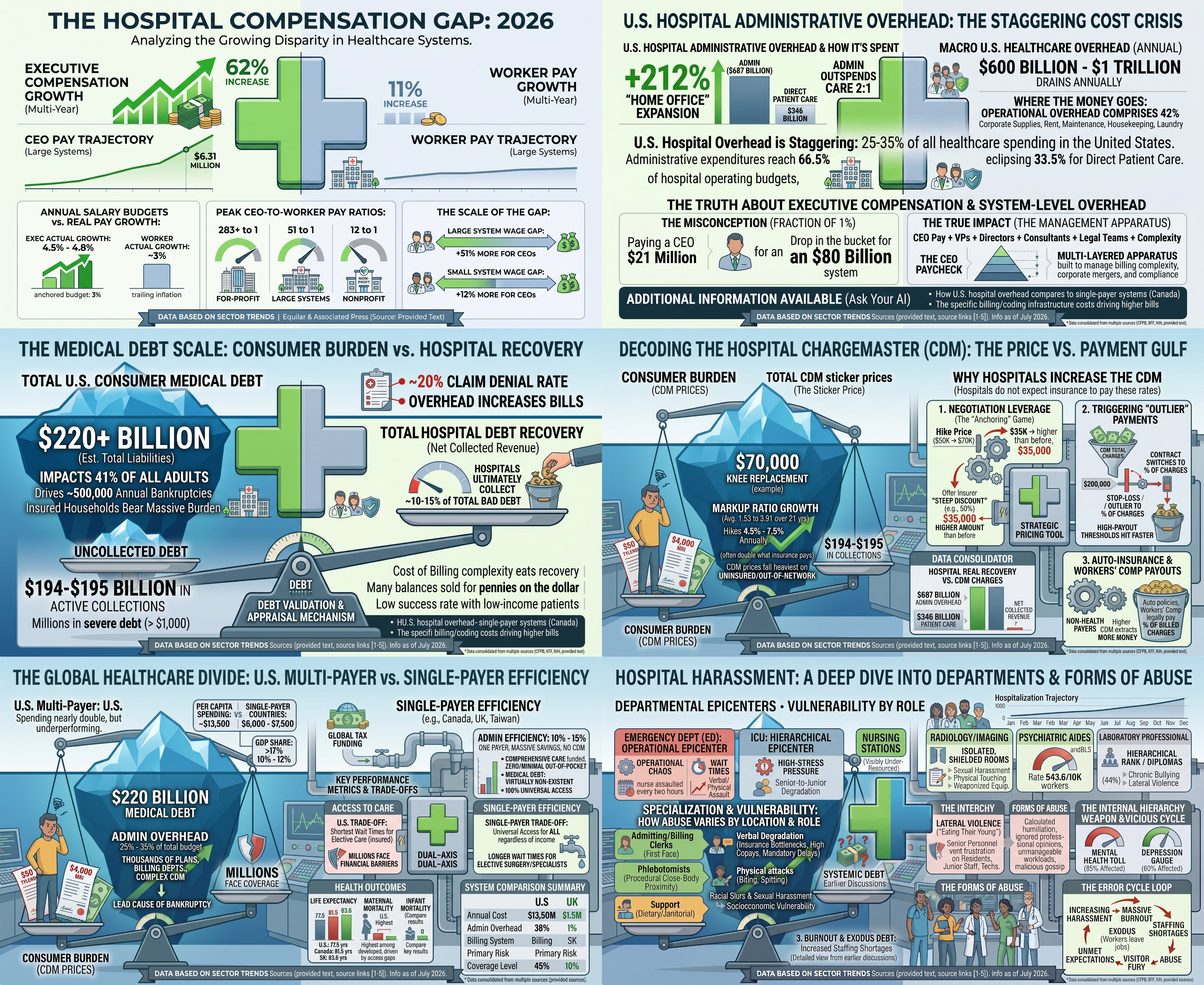

This multi-panel infographic illustrates the financial, operational, and structural strains within the U.S. healthcare system through six key areas:
Executive vs. Worker Pay: Highlights a 62% multi-year increase in executive compensation alongside a 265-to-1 CEO-to-worker pay ratio in for-profit systems, compared to just 11% pay growth for average healthcare workers.
Administrative Cost Overhead: Shows that administrative management absorbs 25%–35% of hospital budgets and drains $600B–$1T annually—outspending direct patient care 2:1.
Consumer Medical Debt: Details $220B+ in total consumer medical debt affecting 41% of U.S. adults, even though hospitals only manage to collect 10%–15% of delinquent accounts.
Chargemaster Price Inflation: Explains why hospital list prices (e.g., a $70,000 knee replacement) are heavily inflated over actual collected revenue (~$19,000) to gain leverage in insurer negotiations and trigger stop-loss payouts.
Multi-Payer vs. Single-Payer: Compares the U.S. system (higher costs at ~$12,500/capita, 25%–31% admin costs, poorer outcomes) with single-payer models (lower costs, 10%–15% admin costs, universal coverage).
Workplace Harassment & Burnout: Maps systemic stress, verbal/physical abuse, and lateral violence across clinical units (ED, ICU, Nursing) that drive staff turnover and medical error feedback loops.
Workplace Harassment & Burnout: Maps systemic stress, verbal/physical abuse, and lateral violence across clinical units (ED, ICU, Nursing) that drive staff turnover and medical error feedback loops.
Leave a Reply